It’s time for an update to our master bedroom! It’s been awhile since I’ve revealed the wall of custom builtins we did last fall, but I’ve been talking a lot about it on instagram over the past few months. Ever since I did the reveal something just didn’t seem right (shocking, this happens a lot!), but I couldn’t quite figure out what it was. I decided to take a risk and see what the builtins looked like with a black background. So let’s see the results and how I got to this point!
Black and White Builtins with Black Background
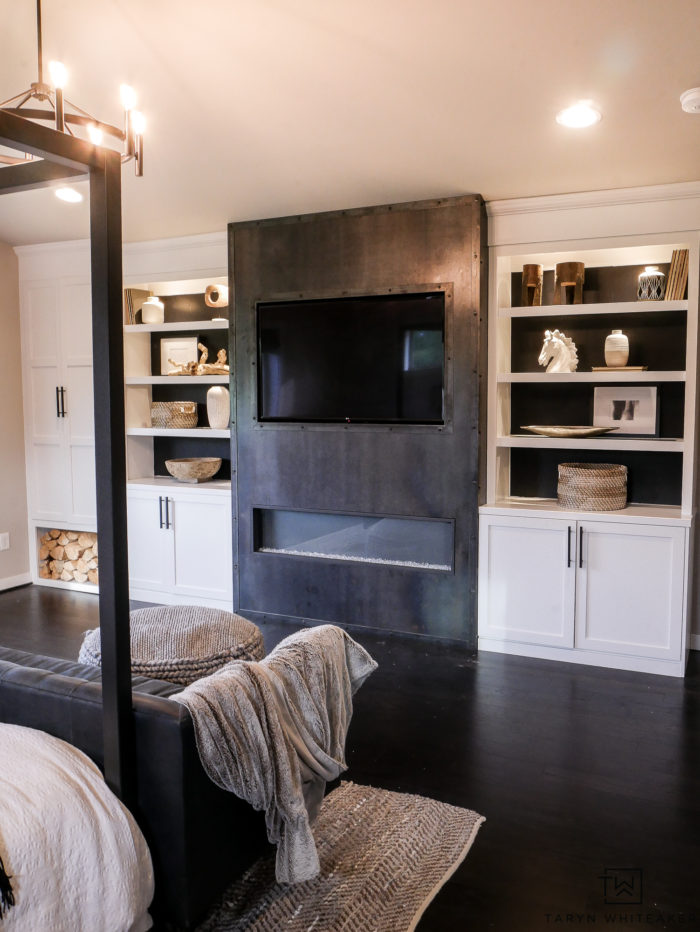
I can be al little indecisive from time to time, but one thing I am excited about is the decision to do something a little different and take this risk. I LOVE how they turned out.
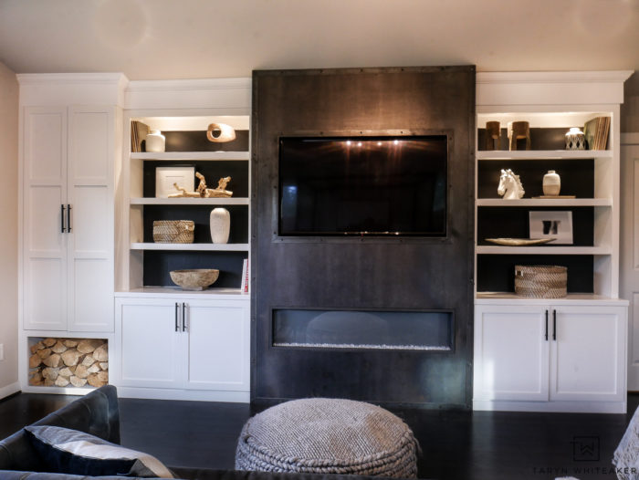
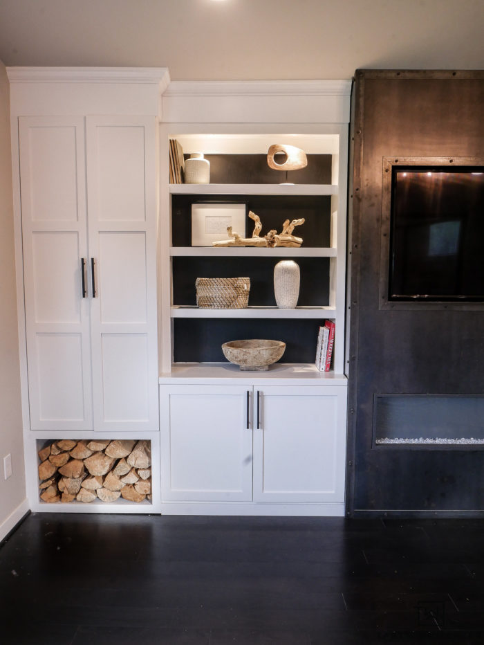
I also tweaked the styling a little bit too. I wanted something a little more modern and minimalistic. I striped down all the previous decor and started from scratch, adding one thing back at a time and adding a few additional pieces. With the black background, I needed to use lighter colored pieces, anything too dark would get lost.
The Design Process
So how did I get to this decision?
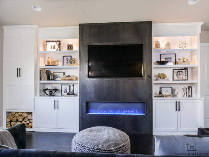
Here are what the builtins looked like when I revealed them last fall. Don’t get me wrong, I think they were gorgeous then and this was on the largest remodel projects we have take on in this house, so I was pretty proud of the results and how it transformed our room. I loved them then, but over the past year I started to crave a change.
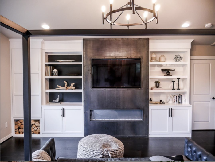

I didn’t want to jump right in and paint the backs of the builtins black. What if I hated it and then I was left with painted builtins and would have to repaint? What if the black competed too much with our big steel fireplace? I needed to come up with a way do a trial run with the black and find something I could remove if I didn’t like.
So I went on Amazon and found this black contact paper that has a subtle wood grain to it. It was only $20 for a large roll and I figure I’d rather be out $20 then making a permanent change to our basically new builtins that I didn’t like. But in the end I absolutely loved the change! It felt way more ‘me’ with the dark background.
Modern Built-in Styling
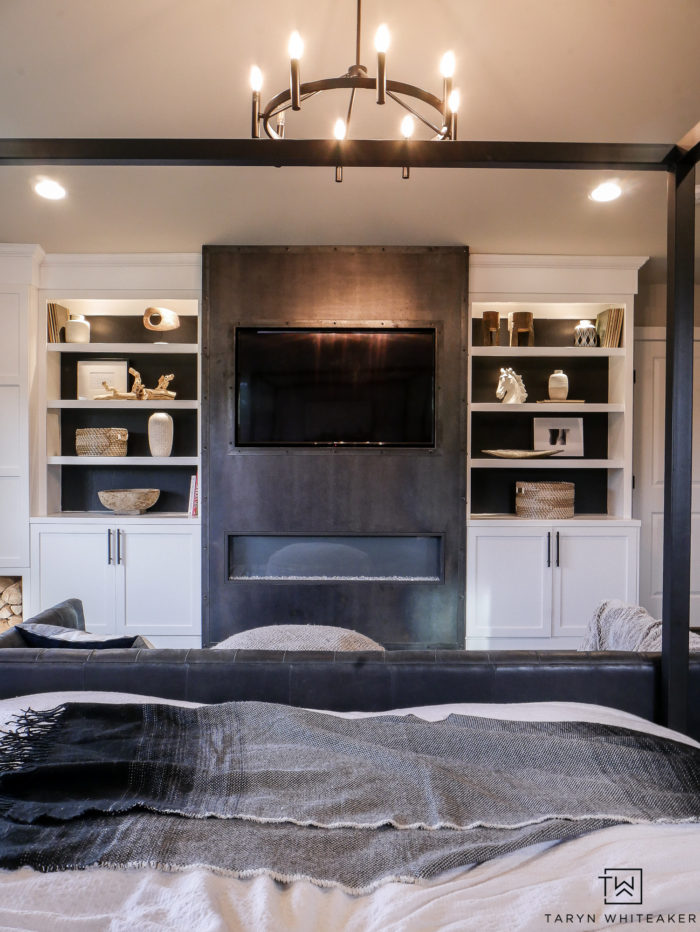
It feels so much cozier in here now and I really love how the black changed the look of the builtins. I love the rich color, the modern vibe and the way the pieces stand out.
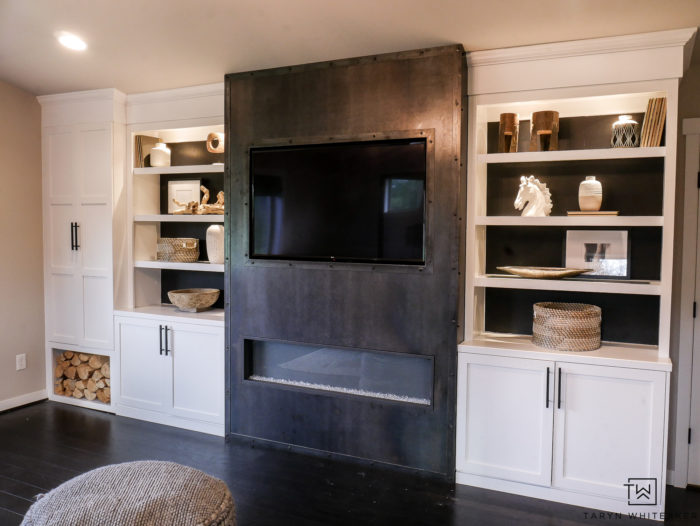
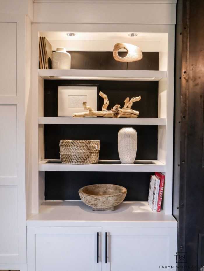
I linked all the accessories from this space below so you can add a few new pieces to your shelves! Styling is hard and finding the balance is hard. But what I have found through this project is simple is better.

I stuck with more natural, organic feeling elements in here. And surprisingly, most of the items I found at either Target, on clearance somewhere or Walmart! Proof that a high-end look doesn’t have to be expensive!
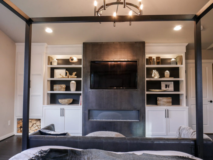
And the beams on the ceiling are going up as we speak! I can’t wait to show you the full reveal of them!

Shop this space:
Here are all the pieces displayed on the shelves (and a few from how I had them previously styled). Also, if I couldn’t some of the item online, I linked to similar items.





Leave a Reply